Balancing Clarity in Information-Dense Employer Cards
UX/UI DESIGN | PRODUCT | VISUAL DESIGN
Designed cards for Prosple’s Employer Ranking product, guiding students from application decisions to offer outcomes.
Timeframe
May 2025 - Aug 2025
Employer
Prosple
My Role
Collaborated with a Product Manager and UX/UI Designer to iteratively design in Figma, validate solutions through moderated usability testing, and conduct desk research to inform design decisions.

Project Overview
Prosple is a job board dedicated to helping students get the best possible start to their careers. One of its key differentiating products is an employer rankings board, showcasing top employers and supporting students in making informed career decisions.
Problem
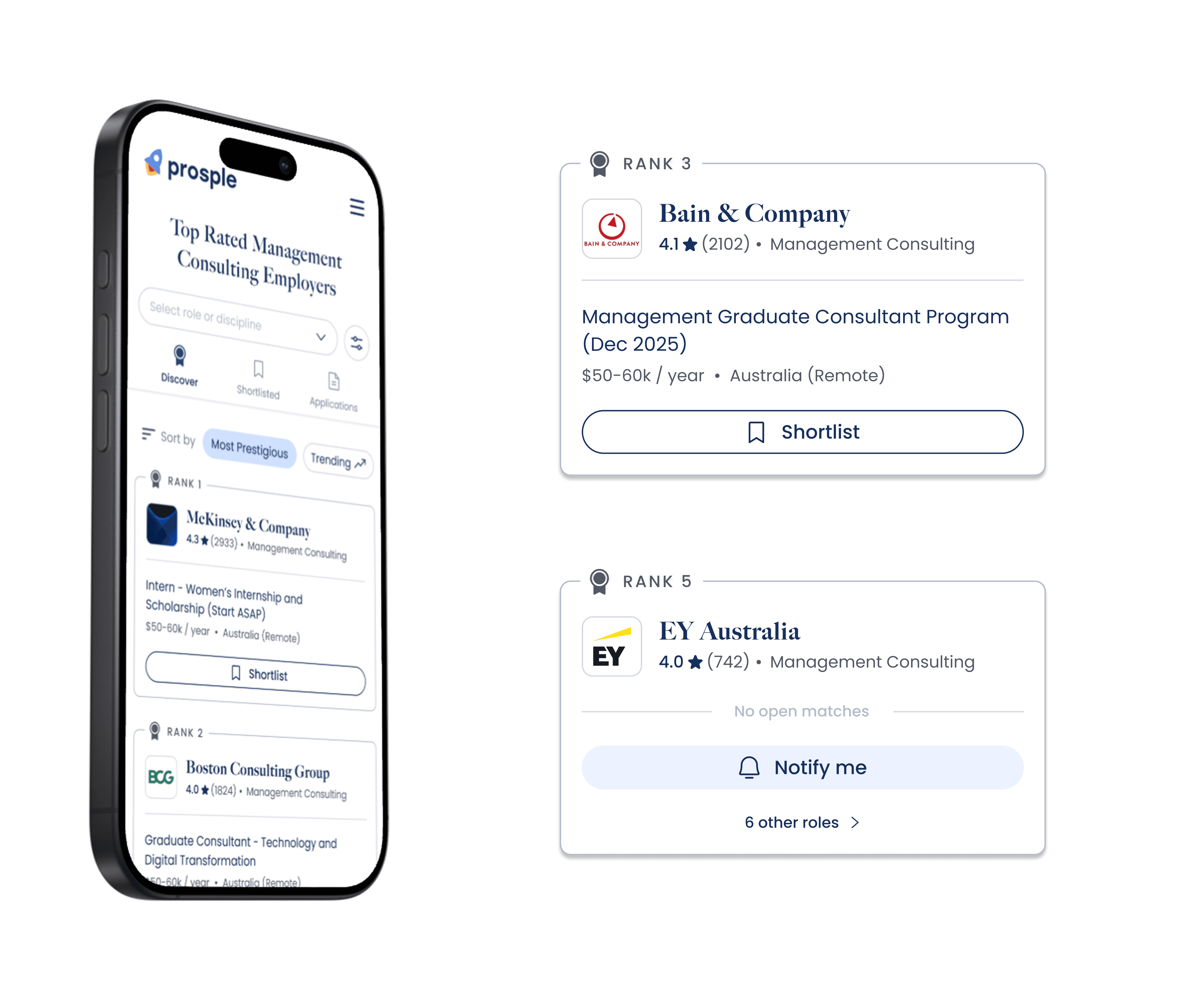
The ranking card is one of the most critical components of the product. Information must be conveyed within a high-density, low-attention environment, where users scan multiple employers at once.
The challenge was presenting the right information clearly and efficiently while encouraging students to apply for roles and keep track of their applications.
Solution
A clean and minimalist card design where each element was intentionally tested and prioritised. The solution focuses on strong visual hierarchy, relevant metadata, and clear, effective calls to action.

Process
How might we present high-density employer information in a way that supports quick scanning and confident decision-making?
Initial Brainstorm
Understanding Visual Hierarchy
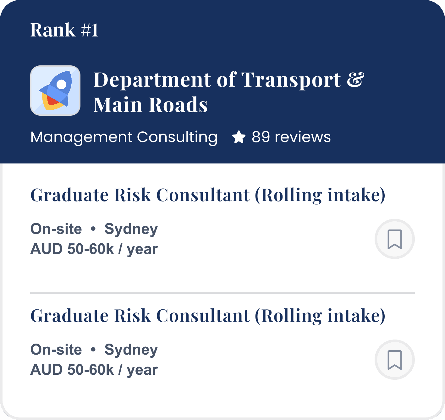
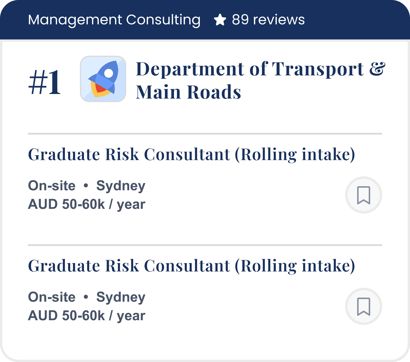
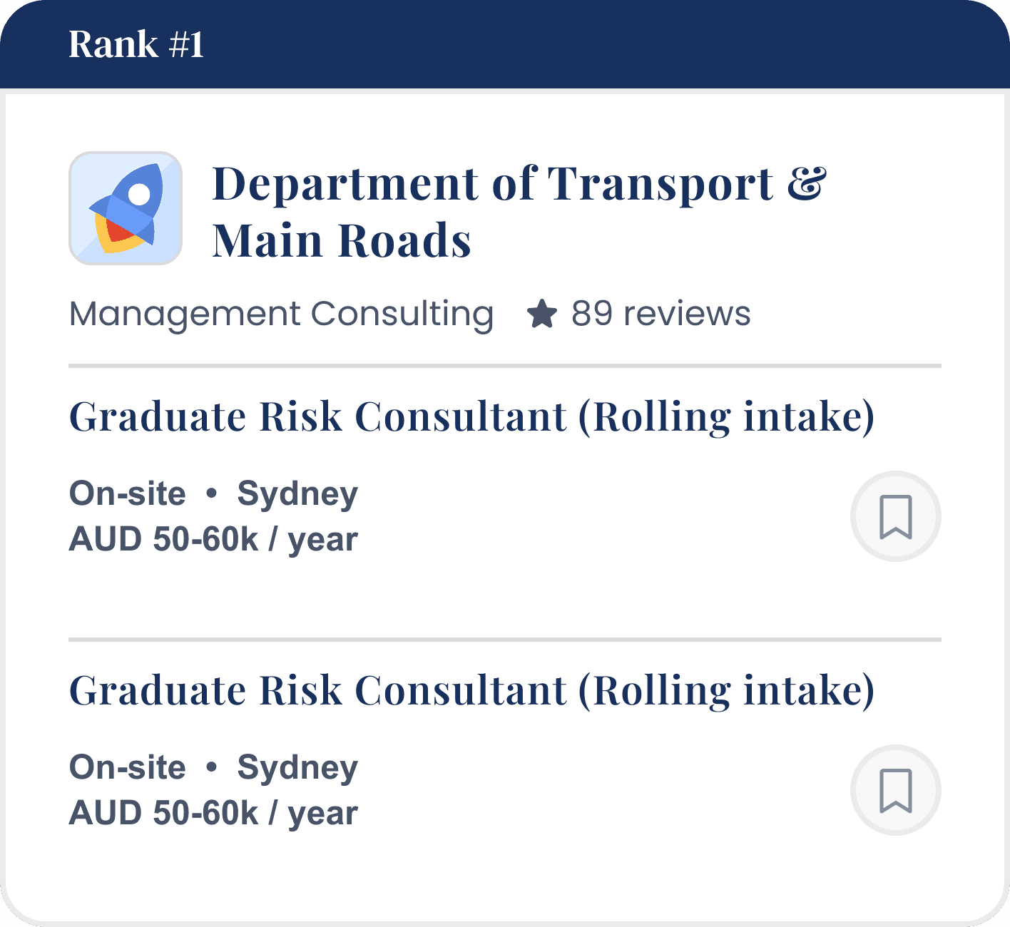
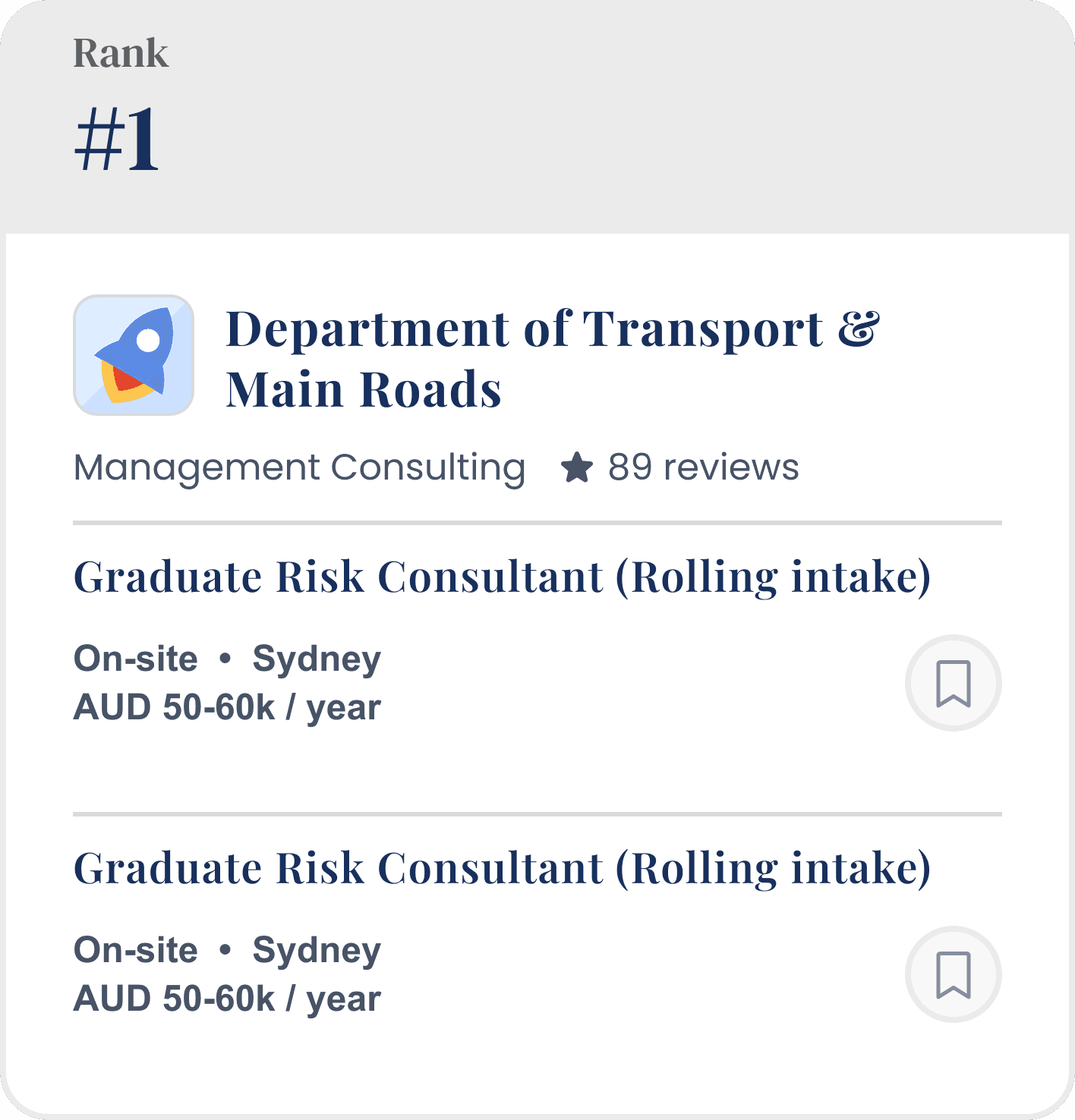
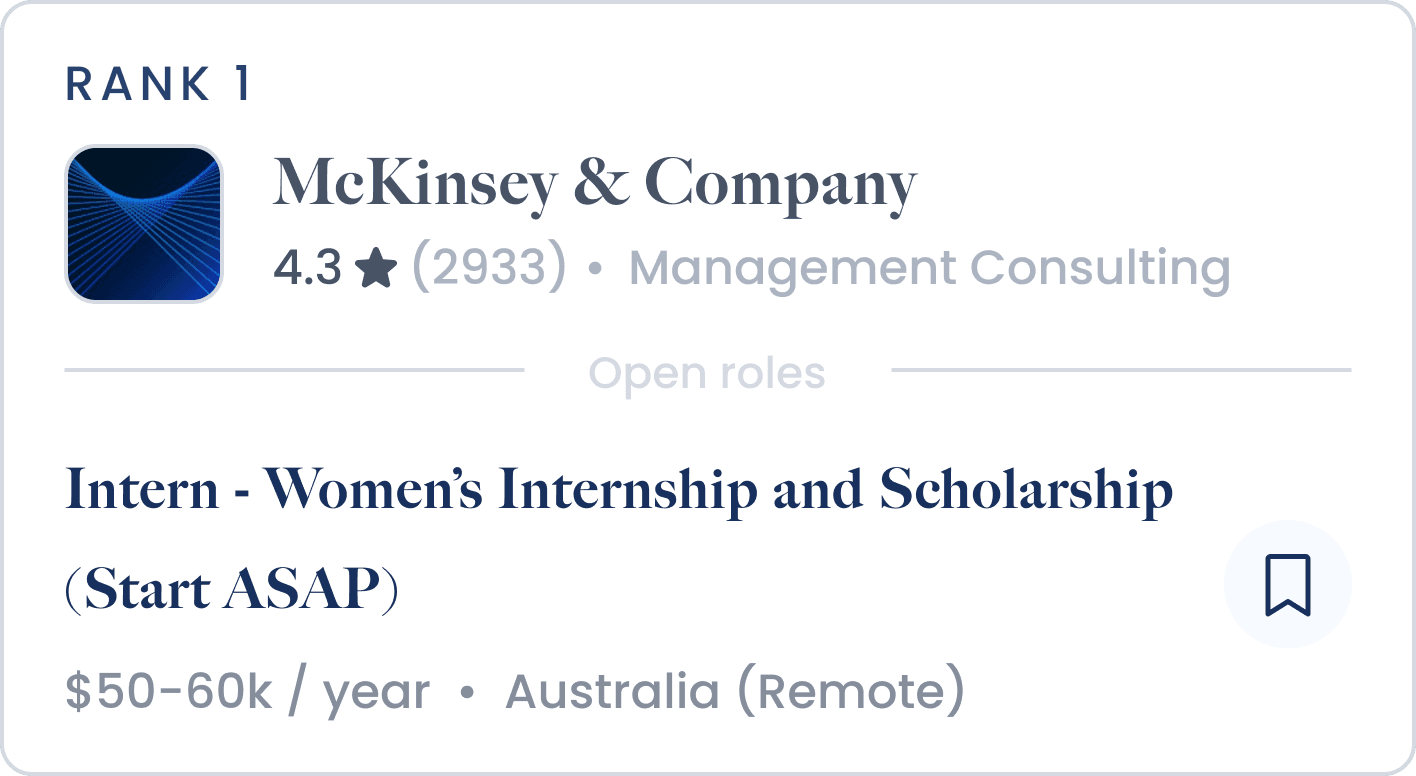
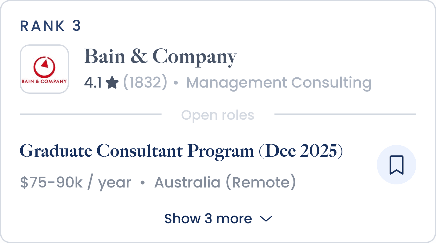
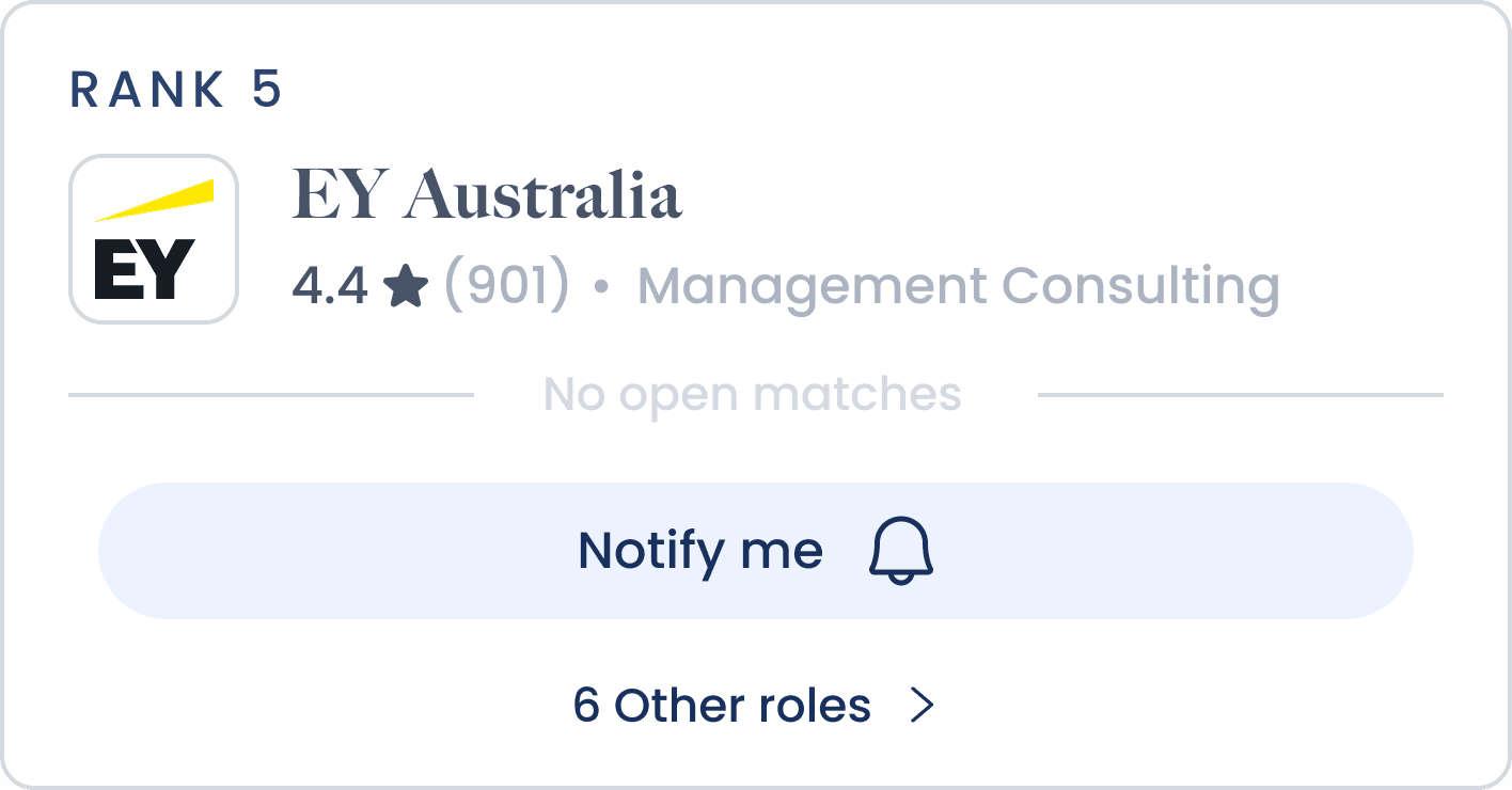
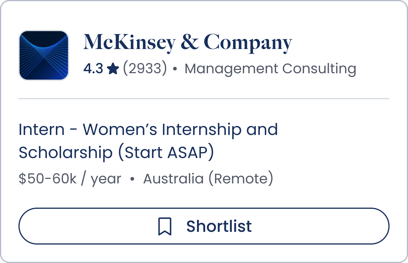
When browsing rankings, students view multiple employers at once and need a way to quickly scan and understand key information. Each card must communicate essential metadata, including the company name, rank, reviews, industry, and currently open roles.
In early stages, we prioritised quantity over quality, brainstorming various ways we can showcase this information.
Design Iteration
Designing for Constraints
The mobile card is highly constrained in terms of space, requiring us to maximise how relevant information is presented for student users. Another challenge was that each company contains varying data, meaning the card needed to be designed to flexibly accommodate different content scenarios.
1 Role Open
Multiple Roles Open
No Roles Open
Design Iteration
Creating Effective Call-To-Actions
The job card needed to encourage students to either apply for a role or save it for later. Making this CTA clear without overwhelming the card was a challenge, leading us to explore multiple button variations across iconography, copy, colour, size, and placement.
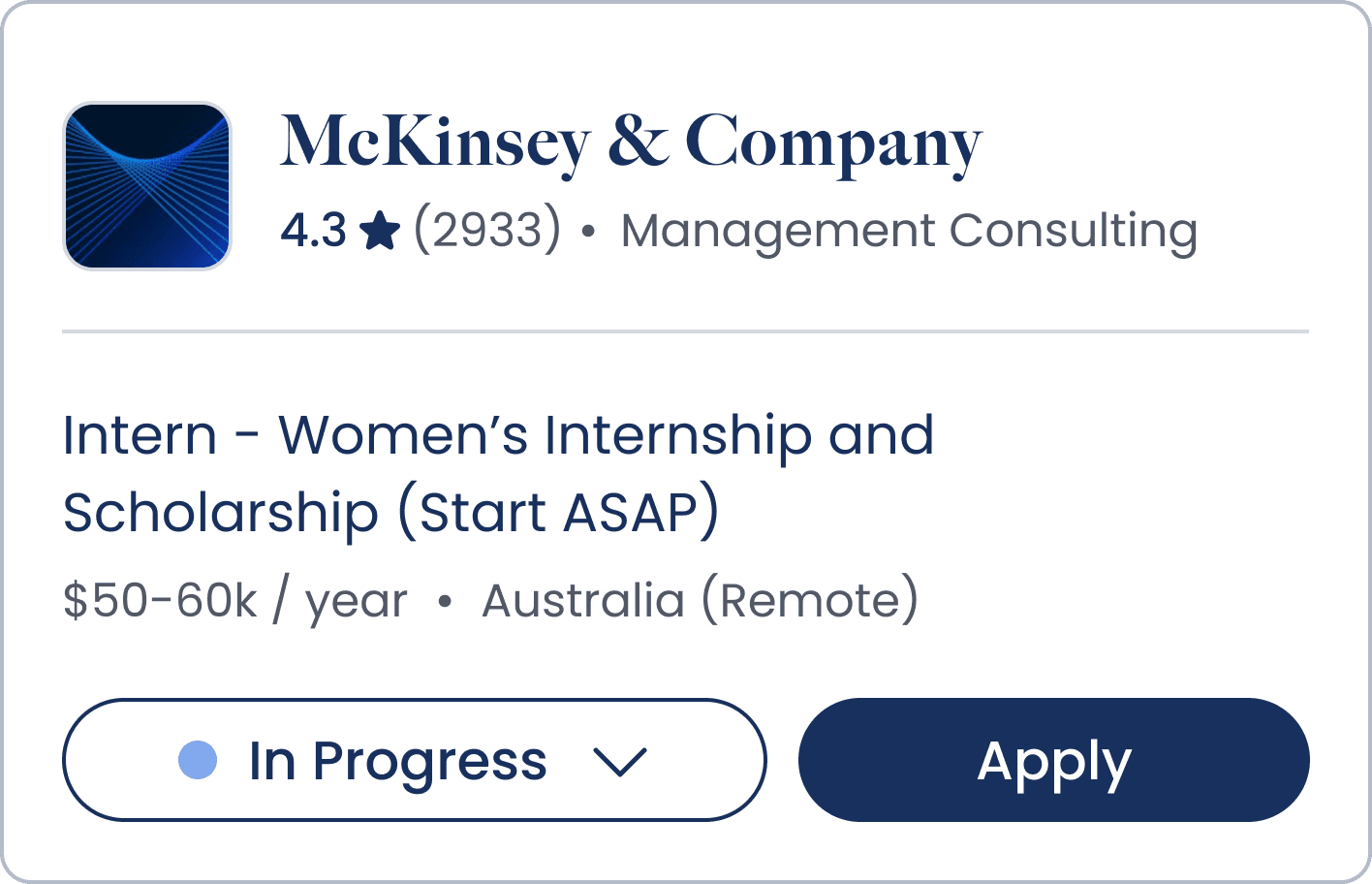
We mapped the user journey to introduce a dynamic save feature. Once a job card is saved, users are encouraged to apply and use a dropdown status to track their progress throughout the application process.
Validation & Iteration
Making Application Stages Intuitive
At each stage, we validated our designs through testing with real users. Participants were asked what they believed they were viewing, what their next steps would be, and whether the product would support their job application process.
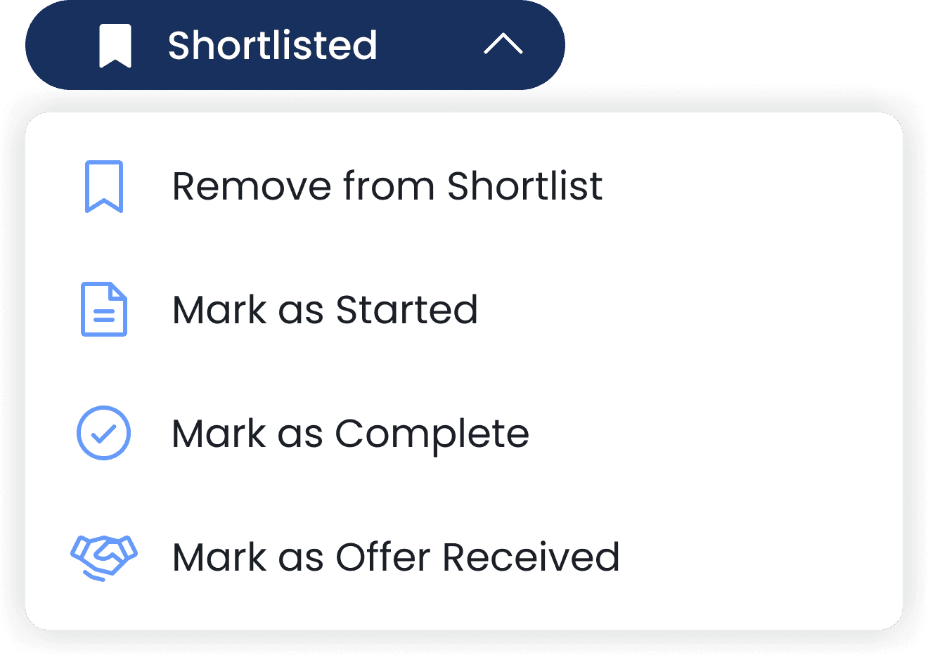
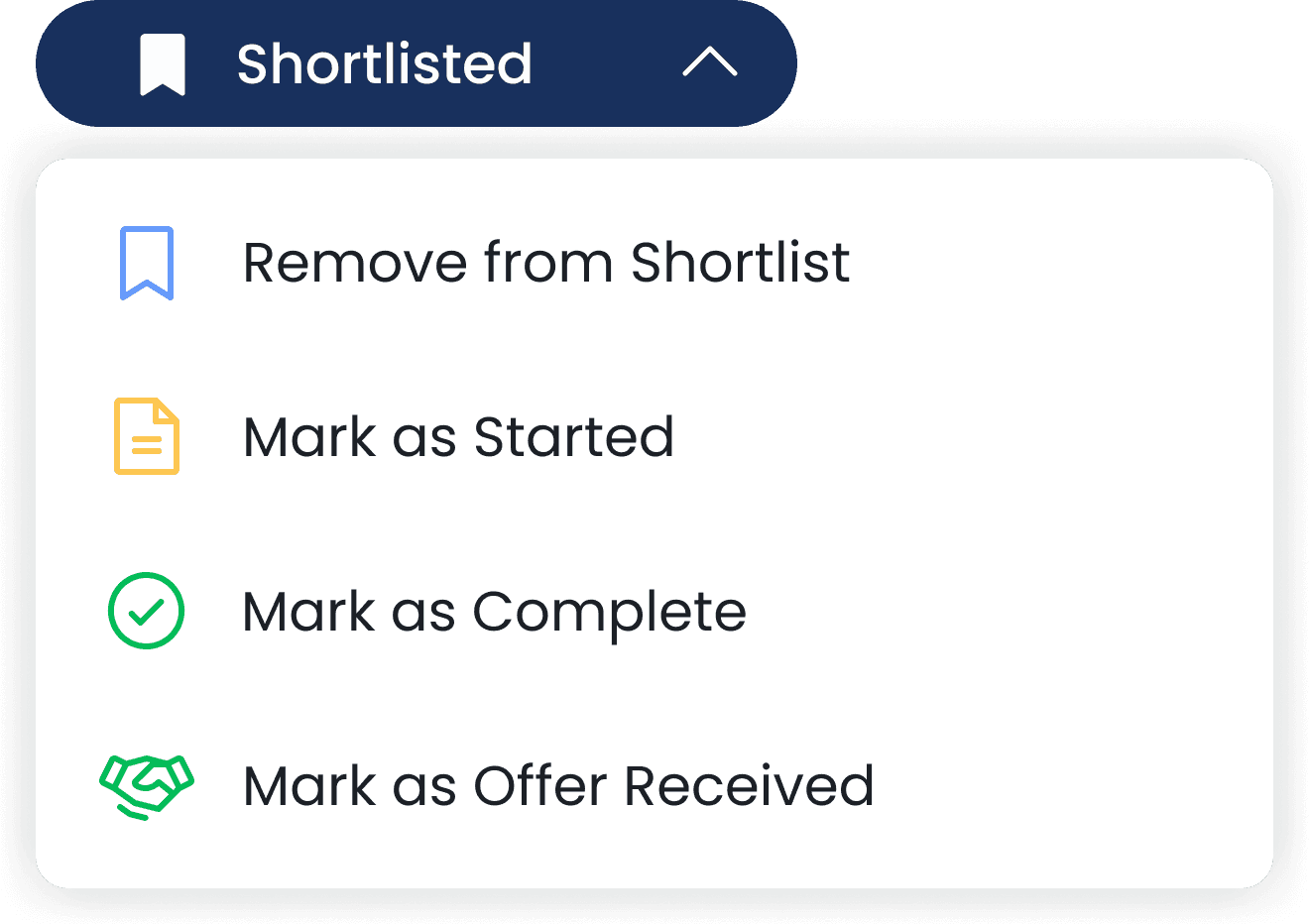
We discovered that some interactions were less intuitive than expected. We refined the copy to better reflect application stages and removed Offer Received, as this step occurs outside the Prosple platform. It was replaced with Archived to better support broader and ongoing usage.

Impact
Design Impact
Delivered 100+ design iterations, improving the user experience for over 1M student users
Lessons Learnt
As one of my first industry experiences, I learned that the discovery process is rarely linear and often requires adapting along the way.
Prioritise the best actions based on available time and resources, leveraging external sources when needed.
Design in variables to ensure solutions can accommodate different conditions and edge cases.
HUNGRY FOR MORE?
LET'S CONNECT.